Doppelganger?
I don't know where to go with this, thought the idea was cool...
Thursday, October 29, 2009
Kittens inspired by Kittens
Eileen inspired by Kasimir.
* I'm not sure about the font choice... kraken seems fine for BALANCE, but for the red text it bothers me. Text suggestions anyone? Maybe... gill sans condensed? apogee rounded sans? :/
* I'm not sure about the font choice... kraken seems fine for BALANCE, but for the red text it bothers me. Text suggestions anyone? Maybe... gill sans condensed? apogee rounded sans? :/
Wednesday, October 28, 2009
Minimalism
To many people the principal idea of Minimalism is to reduce things to its essential elements. It is also regarded as a reaction against the forms created by Abstract Expressionism. Minimalism was a contrast to prior ideas of form and content; It rejected the need to express one's self, to make a social commentary, or allude to history, politics, or religion. Works of Minimalism were to be viewed in its literal presence.
A lot of my work is influenced by the principles and works produced during the Minimalist movement, but my work also reflects the style developed in this neoplasticism movement.
Neoplasticism was a Dutch movement that arose before the era of Minimalism.
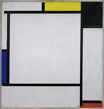
De Stijl Artist, Theo Van Doesburg
Minimalist Work by Frank Stella
I also stumbled across a movement known as Suprematism. This art movement focused on geometric forms that represented the feeling of nonobjectivity. I'm very interested in this movement and will continue to read the writings of Kasimir Malevich.
Here is a link to a more detailed explaination of suprematism. Malevich
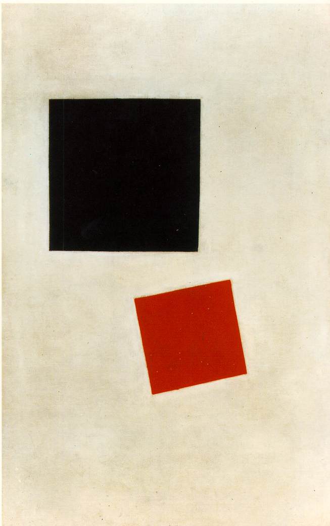
Kasimir Malevich's Black Square and Red Square
A lot of my work is influenced by the principles and works produced during the Minimalist movement, but my work also reflects the style developed in this neoplasticism movement.
Neoplasticism was a Dutch movement that arose before the era of Minimalism.
"It [De Stijl] was posited on the fundamental principle of the geometry of the straight line, the square, and the rectangle, combined with a strong asymmetricality; the predominant use of pure primary colors with black and white; and the relationship between positive and negative elements in an arrangement of non-objective forms and lines." Guggenheim Glossary: De Stijl
The expression of neoplasticism relies on the abstraction of form and color. The works avoided symmetry and attained aesthetic balance by the use of opposition. This element of the movement embodies the second meaning of stijl: “a post, jamb or support”; this is best exemplified by the construction of crossing joints, most commonly seen in carpentry.
De Stijl Artist, Theo Van Doesburg
Minimalist Work by Frank Stella
I also stumbled across a movement known as Suprematism. This art movement focused on geometric forms that represented the feeling of nonobjectivity. I'm very interested in this movement and will continue to read the writings of Kasimir Malevich.
Here is a link to a more detailed explaination of suprematism. Malevich
Kasimir Malevich's Black Square and Red Square

Already a pattern?
Well, just for this week...
I've already noticed that I've been personifying these geometric shapes and I've been playing a lot with space (space... as in outer space? sure that too)
We'll see how long this interest lasts...
Time for pictures.
It's hard to heal triangular wounds.
Thank you Isidore Lucien Ducasse for your words.
My last image upload is a failure that I turned into an obnoxious animated gif with Blingee.com
Stupid really, but entertaining.
Tuesday, October 27, 2009
Random LOLz
Triangle god. Hail. Playing around with making a simple geometric shape appear "holy" or "god-like."
Forest pic unrelated... (besides the awesome sun beam gleaming down on the triangle's godliness)
Forest pic unrelated... (besides the awesome sun beam gleaming down on the triangle's godliness)
Another WIP
Work in Progress? I guess? I'm not really sure where I'm going with this, but I like it...
Triangles, Triangles, Triangles... I can't get them out of my mind.
Triangles, Triangles, Triangles... I can't get them out of my mind.
Monday, October 26, 2009
It's Time To
This is a quick composition I threw together for this specific blog post. It is time for me to work forward and move forward.
I've been dwelling on the form of my final project. I've been frustrated by the subject of my last few ideas. I've been stressed by having nothing. I've felt backed into corners by lots of different people...
It's time for me to allow pieces of myself come out of my work. I have been so detached from my work, as in the subject and content were never reflections of my own feelings.
This project, is the time to explore myself as a designer and as a person. It is ok to expose myself. I won't be able to do this again in the "industry."
The time is now!! SO...
I will work. I will try to pump out compositions fairly often that reflect what I am thinking, how my day has been, what I'm interested in, what I'm listening to... whatever! various things! I'm going to make lists and from those lists I will create interesting compositions from seemingly less important subjects. Hopefully the viewer will see a different view on that subject, of that day, and learn a little bit about me.
Graphic designers are often times detached from their work because they are constantly satisfying clients.
From here on out, I'm satisfying myself. :p
In a few months a pattern should arise (I am a very predictable person). From this pattern, a series can be created and certain compositions can be chosen.
I will try to post more compositions and keep text minimal. Pictures make blogs more interesting right?
Saturday, October 24, 2009
WIP
Here is a work in progress.
Vicodin and alcohol increases the effect of alcohol, nausea, and dizziness.
I'm working on... the color scheme.
Vicodin and alcohol increases the effect of alcohol, nausea, and dizziness.
Thursday, October 22, 2009
Posters
I want to make posters. Same basic concept, same subject, different angle.
I'm still dealing with Commonly Used/Abused drugs, the same ones I listed before for the same reasons. I am exploring compositions with simple shapes that reflect my interpretation of these drug interactions.
Here is a close up detail of the mushroom and Vicodin poster.
I'm still dealing with Commonly Used/Abused drugs, the same ones I listed before for the same reasons. I am exploring compositions with simple shapes that reflect my interpretation of these drug interactions.
Here is a close up detail of the mushroom and Vicodin poster.
Tuesday, October 20, 2009
Monday, October 19, 2009
Medication
Here is my current list of drugs I will be looking at. I came to this list by looking at a few things; I looked at the top 300 list of most commonly prescribed drugs, drugs by their schedule ranking (as determined by the US Drug Enforcement Administration), by what the US Department of Health and Human Services and SAMHA's National Clearing House for Alcohol and Drug Information found to be highly used, and by what the National Institute on Drug Abuse found to be commonly abused.
Prescribed Drugs:
Vicodin, Oxycontin, Valium, Xanax, Prozac, Adderall, Ritalin, Duragesic (fentanyl), Amytal, and Nardil
Possibly Cymbalta and Ambien as well.
OTC Drugs:
A Cough and Cold Syrup/Pill with dextromethorphan ( DXM), Coriciden (also contains DXM), Acetaminophen, Ibuprofen, Grape Fruit Juice, Alcohol, and Tobacco
Possibly diet pills. Those can be abused for a "speed like" feeling.
Street Drugs:
Ketamine, Cocaine, Heroin, Marijuana, Methamphetamine, Ecstasy, LSD, Mushrooms - Psilocybin, Angel Dust/PCP, Opium
I think I might need to reduce the number of drugs I am looking at. Twenty seven is quite a few, but I think each one is definitely worth the time to include. We'll see...
I've limited the information I'm looking at to:
What is this drug? - Basic and general information about what this drug is
How commonly is this drug used/abused? - This explains why I'm looking at this drug (out of all the thousands of drugs out there). I might add how it is abused, the process of abuse... something along these lines.
What are known side effects? - Stating known effects of these drugs alone. I think it might be interesting to show what effects can happen just by the drug itself.
What are known interactions? - Besides what I am comparing in my chart.
Dosage/Pill Strength or what you can buy on the "streets" - I think its important to have a constant amount to base usage off of. Its hard to calculate dosage of street drugs, so I'm going by the amount you can buy. That is the most constant measurement I can go buy.
I'm not looking at any other information because I only want information that is related and helpful to understanding my chart. This helps weed out a lot of text and content as information about each of these drugs are endless.
Thursday, October 15, 2009
Mock Up
Is what it is...
I'm trying to set up the information I'll be looking at and a basic layout for each page of the booklet. I think this simple and abstract visualization of the medication is desired for this project because it feels fairly neutral. I don't want there to seem like there is any personal bias in this booklet. It should feel formal and neutral because its main purpose is to provide information.
I need to be kind of removed from this booklet because I will be referencing sources like UHS and I do not want to reflect any of my personal opinion on what they say. My voice and feelings about this situation is heard through the fact that I am even doing a project about it and my attempts to educate people about their choices.
I also feel that when addressing something as sensitive as drugs, that the tone should be strictly informative because no one wants to be told by a person what to do or how to feel about something.
I'm happy with my project so far. The kind woman at UHS, Gwendolyn A Chivers, applauded me in my attempt to create something that will help people outside of myself. Although this is a concept project, I really want this to be a helpful reference for people.
Thursday, October 8, 2009
Examples of Drug Interaction Sites
http://www.drugs.com/drug_interactions.html
- Results are confusing to read and dense
http://www.medscape.com/druginfo/druginterchecker
- Clean design, but illegal drugs are not an option for comparison
http://www.healthline.com/druginteractions
- Only shows known interactions of the drug you pick, no custom comparison available
www.erowid.org
- Amazing website full of great information and experiences, but extremely large and hard to navigate
New Directions for IP
What am I doing?
Educated people about the consequences of mixing over the counter drugs, prescription drugs, and illegal street drugs.
How am I doing this?
Creating a series of posters that will inform people about the effects of combining certain drugs. I will make these posters available by putting them on the web as well as printing them in a pamphlet form. The web is a great way to make information attainable, print can be a way to distribute information to those without internet, and the posters are both educational and promotional for the website.
Drugs I will be looking at, The Most Common:
- Over the counter drugs
- Prescription drugs
- Illegal street drugs
Why would you want to know this information?
Combining certain drugs together can cause fatal reactions.
Combining certain drugs together can cause euphoric feelings.
Why am I interested in this?
I am currently taking prescribed medications and I think it is important to know what drugs I can and cannot take with this medication. So, I personally need this information. But, I've also had friends who have lost a lot from combining drugs. I had a friend who went into a coma because he mixed too many opiates together. Many of my friends have been hospitalized or gotten sick from mixing drugs together. If I could distribute something to them that was easy to read and informative, then maybe I can educate them about the consequences and protect them from making a harmful combination. I can't stop them from taking drugs. I won't question them either. I just want to educate them about the dangers that they are unaware of.
What is the current problem with drug interaction information?
Websites and pamphlets I have seen are too specific on a certain drug (a pamphlet on zoloft says what drugs you can't take with it, but then if you take another drug you need another pamphlet to see what drugs you can't take with that... etc). Online drug interaction applications do not include illegal drugs as a selection option.
This information is out there, but it isn't consolidated or it is hard to read/decipher. I want to make this information visually appealing but also easily readable and usable.
I am going to use a lot of information graphics, of different types and styles. In this way, I can use the information I've already gathered for this project.
I love the idea of this project. I'm personally connected to it. I think it has a great purpose and will be extremely informational.
Wednesday, October 7, 2009
Tuesday, October 6, 2009
Major Chinese Languages and Dialects
This is the first diagram I have completed. It fits under the category flow chart. It is simple, clean and utilitarian in style, no unnecessary decorations or embellishments. I still need to double check those percentages. I don't think they're right?
After I do that, I can begin my next graph which will be a second iteration of this in a more complex style. BUT it will still be a flow chart...
Processing
http://processing.org/
Amazing...
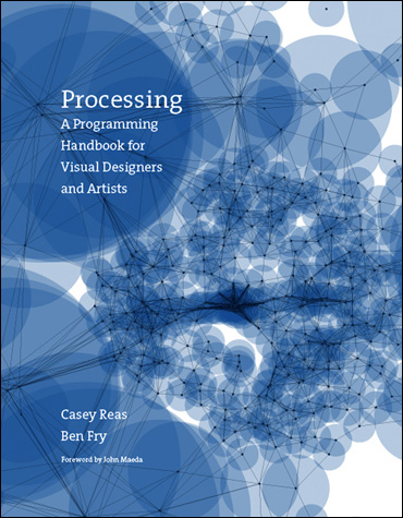
I just bought this book. I'm going to learn how to code things in this program, because everything that comes out of it is beautiful.
Amazing...
I just bought this book. I'm going to learn how to code things in this program, because everything that comes out of it is beautiful.
Monday, October 5, 2009
Head first...
I've decided that dwindling on my writings is making me lose my footing on my project. I mean, all it is is writing and staring at it doesn't help me create anything... So, I'm jumping right into creating information graphics in hopes to help bring my project in context.
I think that I will try to make 3 (or 5? depending on time) posters per category of information graphic:
- Comparative Statistical Diagrams
- Flow Diagrams
- Tabulations/Timetables
- Maps/Decorative maps
- Diagrams Used as Design Elements
(list taken from the content list of Graphis Diagrams)
I've started working on a flow diagram about the major dialects in China. I'll post images when I complete them.
Subscribe to:
Comments (Atom)


