I finished my grant application.
I got a great comment from Kristen reminding me to make sure the stages between sadness and irrationality are distinctly different. This will help reinforce the craziness in irrational.
I want Call of Duty: Modern Warfare 2 so bad...
I have to finish Borderlands.
I have to continue Aion.
Too many new video games + IP = disaster haha
Wednesday, November 11, 2009

Tuesday, November 10, 2009
Iterations
Here are a few of many more to come.
I tried experimenting with landscapes and textures to create a surrounding, an environment that describes each of these stages. I was inspired by the cover of a book on my desk, Data Flow.

The floating spheres are so interesting in how unnatural they are. This type of perfect geometric shape doesn’t exist often in natural landscapes yet here it is in a natural plane. So, I wanted to see if I could bring some interests to my compositions by including a background element.

Sadness was tough because it so strongly communicates a bleeding wound. Skin was an obvious first choice. I then tried to use textures and materials that were like skin in their properties (color,
texture...) I tried using the skin from other animals and plants as well. I even used the texture of a real heart, which I like a lot. For irrational, I experimented with photos of space and things like head xrays and mri scans.
I also noticed that the second “set” has become all images of the body... not sure if I like that or not. Hmmmmm... maybe... maybe.
I tried experimenting with landscapes and textures to create a surrounding, an environment that describes each of these stages. I was inspired by the cover of a book on my desk, Data Flow.

The floating spheres are so interesting in how unnatural they are. This type of perfect geometric shape doesn’t exist often in natural landscapes yet here it is in a natural plane. So, I wanted to see if I could bring some interests to my compositions by including a background element.

texture...) I tried using the skin from other animals and plants as well. I even used the texture of a real heart, which I like a lot. For irrational, I experimented with photos of space and things like head xrays and mri scans.
I also noticed that the second “set” has become all images of the body... not sure if I like that or not. Hmmmmm... maybe... maybe.
Monday, November 9, 2009
Sexy Shapes
So, I'm currently doing color tests on the foamcore. People are suggesting that I find a way to cover up the edges of the foamcore. I've been trying to glue paper on the edges, but that takes such meticulous care. I need to research other materials that can be laser cut or at least talk to someone who knows of one that is both light and smooth. :\ hrm...
I'm a little bummed, no one came to talk to me today...
Until then, here are two compositions I did today. I was just playing around. :) Enjoy.


I'm a little bummed, no one came to talk to me today...
Until then, here are two compositions I did today. I was just playing around. :) Enjoy.


Sunday, November 8, 2009
New Photos
Here are some better photos of my two tests. The second test, I'm going to turn into the All Student Show.


Monolith


Monolith
4Walls
I wouldn't say that my chosen content is a direct result from suggestions of others, but it was heavily influenced by the train of thought that resulted from those suggestions.
When I am asked these questions about my family or having a split identity between cultures, it can be narrowed down to asking me what it feels like to be depressed or to have depression. Depression is something that plagues my family, including myself. Especially, when it comes to the topic of my family. We are very strange people. We don't talk about our situation. We try to save face for our father. We live separately in order to support the others. All these things puts so much of a strain on each of us. So, the topic of my family and identity is interesting, but also depressing.
So, that is how I arrived at my current place. I have made 4 compositions. Each one relating to a wall that it will rest on. For sake of conversation, I have titled each piece. These titles are not necessarily important to the project. However, a project title will prove to be very critical in the understanding of my project and will have to be picked carefully.

* Worth the click to enlarge
This topic is so personal to me and it's so revealing. At first I wasn't sure if I could push myself to go that far, but it's allowed me to create compositions with very strong content that I am intrigued and will pursue it.
The explanations:
Initial Impact: This is the feeling when some negative event or a series of negative events just becomes lodged in your mind and heart. It is inescapable in that it consumes your thoughts. It may not even be a significant problem, but it is to you. For you, it is the "last straw."
The black triangle obviously represents the negative event(s) and the cracks signify this problem spreading everywhere and branching off into more problems. The position of the triangle signifies a violent action (to get it lodged in there).
The yellow line (or circle) hints towards where the viewer should stand. It should be far enough where they really feel like an outsider to the project. The crack then leads to the next wall, in attempts to create a kind of path and order in viewing.
Sadness: This poster represents the feeling of sadness you feel when you start to analyze all the negative events. Even when the negative events are removed or that initial impact has faded, its impossible to stop your eyes from dripping with tears. It's impossible to not feel an ache in your heart like your mind and heart are melting/bleeding. You are in a hole of feeling very sad and you're not sure how to get out of it.
The pyramid on the ground is to reaffirm the idea that this initial impact has been "removed."
The red blood/path leads into a yellow ribbon into the next triangle, feeding the irrationality.
Irrational: I call this the response stage. This stage is, like I said, fueled/fed from the previous stage. You have an explosion of emotions and thoughts. Many times you think you make sense, you believe your thoughts are rational. But, in fact, they are very irrational and unlike yourself. You feel sadness, hopeless, and disparity. These feelings just "drip" into your mind like a poison.
The triangle should be black, but it was hard to make the effect so it looks gray. The black triangle represents this kind of black hole that is constantly being fed by the last stage. It is chaotic and, honestly, a horrible place to be. In the background, there is a rectangle whose lines should be straight. They're crooked and uneven to represent something that you think you know what it should be, but its not quite right. This is similar to your thought process and possibly even actions. It seems right, you know what its suppose to be, but it's all wrong and messed up. The black drip signifies the dripping of these thoughts and actions back into your mind.
Numb: And in the end, when all this has burnt itself out... you feel nothing. You go about your everyday business. You've forced yourself to forget what's happened. You just feel numb.
For this composition, I intend for the black triangle to be painted with matte black paint, and the poster to be painting in a high gloss paint. It symbolizes that kind of dullness, numbness and emptiness you feel you've become. The high gloss is a kind of a nice touch in the sense that it can represent a kind of nice quality, nice touch to the surroundings and the matte triangle is still just... matte. It's flat, 2D and great to describe this stage.
The best part, is that the very next wall is the beginning of this process, because that's how it works. Depression is a constant cycle of this process, and all that differs is the amount of time you go from numb to initial impact.
I am still exploring new ways to portray these four stages.
In fact here is my current to do list:
- Explore painting on the material
- Explore gluing printed color sheets to material
- Expand on compositions
- Create laser cutting files for pyramid
- Re-photograph tests
- Buy stuff
- Grant Proposal
- Model a 3D version of the final structure. So, I will kind of know what I'm doing.
COMMENTS?!
When I am asked these questions about my family or having a split identity between cultures, it can be narrowed down to asking me what it feels like to be depressed or to have depression. Depression is something that plagues my family, including myself. Especially, when it comes to the topic of my family. We are very strange people. We don't talk about our situation. We try to save face for our father. We live separately in order to support the others. All these things puts so much of a strain on each of us. So, the topic of my family and identity is interesting, but also depressing.
So, that is how I arrived at my current place. I have made 4 compositions. Each one relating to a wall that it will rest on. For sake of conversation, I have titled each piece. These titles are not necessarily important to the project. However, a project title will prove to be very critical in the understanding of my project and will have to be picked carefully.

* Worth the click to enlarge
This topic is so personal to me and it's so revealing. At first I wasn't sure if I could push myself to go that far, but it's allowed me to create compositions with very strong content that I am intrigued and will pursue it.
The explanations:
Initial Impact: This is the feeling when some negative event or a series of negative events just becomes lodged in your mind and heart. It is inescapable in that it consumes your thoughts. It may not even be a significant problem, but it is to you. For you, it is the "last straw."
The black triangle obviously represents the negative event(s) and the cracks signify this problem spreading everywhere and branching off into more problems. The position of the triangle signifies a violent action (to get it lodged in there).
The yellow line (or circle) hints towards where the viewer should stand. It should be far enough where they really feel like an outsider to the project. The crack then leads to the next wall, in attempts to create a kind of path and order in viewing.
Sadness: This poster represents the feeling of sadness you feel when you start to analyze all the negative events. Even when the negative events are removed or that initial impact has faded, its impossible to stop your eyes from dripping with tears. It's impossible to not feel an ache in your heart like your mind and heart are melting/bleeding. You are in a hole of feeling very sad and you're not sure how to get out of it.
The pyramid on the ground is to reaffirm the idea that this initial impact has been "removed."
The red blood/path leads into a yellow ribbon into the next triangle, feeding the irrationality.
Irrational: I call this the response stage. This stage is, like I said, fueled/fed from the previous stage. You have an explosion of emotions and thoughts. Many times you think you make sense, you believe your thoughts are rational. But, in fact, they are very irrational and unlike yourself. You feel sadness, hopeless, and disparity. These feelings just "drip" into your mind like a poison.
The triangle should be black, but it was hard to make the effect so it looks gray. The black triangle represents this kind of black hole that is constantly being fed by the last stage. It is chaotic and, honestly, a horrible place to be. In the background, there is a rectangle whose lines should be straight. They're crooked and uneven to represent something that you think you know what it should be, but its not quite right. This is similar to your thought process and possibly even actions. It seems right, you know what its suppose to be, but it's all wrong and messed up. The black drip signifies the dripping of these thoughts and actions back into your mind.
Numb: And in the end, when all this has burnt itself out... you feel nothing. You go about your everyday business. You've forced yourself to forget what's happened. You just feel numb.
For this composition, I intend for the black triangle to be painted with matte black paint, and the poster to be painting in a high gloss paint. It symbolizes that kind of dullness, numbness and emptiness you feel you've become. The high gloss is a kind of a nice touch in the sense that it can represent a kind of nice quality, nice touch to the surroundings and the matte triangle is still just... matte. It's flat, 2D and great to describe this stage.
The best part, is that the very next wall is the beginning of this process, because that's how it works. Depression is a constant cycle of this process, and all that differs is the amount of time you go from numb to initial impact.
I am still exploring new ways to portray these four stages.
In fact here is my current to do list:
- Explore painting on the material
- Explore gluing printed color sheets to material
- Expand on compositions
- Create laser cutting files for pyramid
- Re-photograph tests
- Buy stuff
- Grant Proposal
- Model a 3D version of the final structure. So, I will kind of know what I'm doing.
COMMENTS?!
Friday, November 6, 2009
Form Tests 1 and 2
So, yesterday and today I spent laser cutting and assembling these test forms. They are currently pasted to foamcore, but that was obviously a mistake since the foamcore is warping and pulling itself from the form. The forms themselves, however, are doing just fine!
I'm really happy with how they turned out. I have two big problems right now. I am trying to figure out how to continue to build "height" on the pyramid, therefore building "depth." Also, I have a half sized model that I am trying to figure out how to put color on. Tomorrow, I plan to finish off my second test and do color tests on my half scale model.
Below is a picture of my first test, which was far too shallow and I was a little messy with the glue.

Here are pictures of my second test which was much more successful.


For some reason these pictures got really compressed... I'll try and post better ones when I get my tripod back.
I'm really happy with how they turned out. I have two big problems right now. I am trying to figure out how to continue to build "height" on the pyramid, therefore building "depth." Also, I have a half sized model that I am trying to figure out how to put color on. Tomorrow, I plan to finish off my second test and do color tests on my half scale model.
Below is a picture of my first test, which was far too shallow and I was a little messy with the glue.

Here are pictures of my second test which was much more successful.


For some reason these pictures got really compressed... I'll try and post better ones when I get my tripod back.
Wednesday, November 4, 2009
A New Structure
I am thinking about changing from a wall installation to creating a structure to house the posters. This rectangle (or triangle, or pentagon the sides determine how many posters are displayed) will allow for the depth of the elements to go deeper than a wall would allow. It also could help visual a point that all the elements recede to.
I think the biggest reason I am interested in this form is because it would force a viewer around the structure to view all the posters. This movement around makes them look at the posters from various different angles that they might not be inclined to do if these posters were on a wall.
Here's a sketch if what I'm saying makes no sense...

I'm also looking at Jen Stark for inspiration. She truly is a master of perception and color.
I think the biggest reason I am interested in this form is because it would force a viewer around the structure to view all the posters. This movement around makes them look at the posters from various different angles that they might not be inclined to do if these posters were on a wall.
Here's a sketch if what I'm saying makes no sense...

I'm also looking at Jen Stark for inspiration. She truly is a master of perception and color.
Tuesday, November 3, 2009
What I did today
I tried to figure out what materials I would need, what facilities I would use, and the size of the poster I would want to work with.
This will be a pricey project, but totally worth it.
Here is an image of the poster dimensions I drew up. (24x36, which I guess is a fairly regular sized poster) It looks bigger in real life... but I kind of want to go bigger...

I'm still trying to decide how many posters I'd like to do. The more I do, the more holes I need cut into a wall. :/ Hrm...
This will be a pricey project, but totally worth it.
Here is an image of the poster dimensions I drew up. (24x36, which I guess is a fairly regular sized poster) It looks bigger in real life... but I kind of want to go bigger...

I'm still trying to decide how many posters I'd like to do. The more I do, the more holes I need cut into a wall. :/ Hrm...
Sketch Up
Please ignore the horrible colors... I wasn't paying attention to the markers I was choosing. So, yes they're all clashing and gross.
But, here is the highly detailed render of what I envision... the installation to be like.

But, here is the highly detailed render of what I envision... the installation to be like.

Po Stur Inshtaulashion
Poster Installation.
Posters and installation projects are both temporary forms of display. My interest is in combining these two disparate disciplines in an effort to explore alternative means of displaying graphical elements. The compositions that I have been working on have begun to converge in style and focus, and by continuing to advance and discover the patterns behind these daily compositions I hope to come to a conclusion which will be fitting of this hybrid presentation.
The designs I choose to use for the pieces will focus on space, depth, and balance. By incorporating the 3rd dimension into these typically flat works, one can accentuate the aforementioned elements while also adding another layer of interest as the viewers perception of these pieces changes as they view the piece and discover the physical depth hidden in the wall.
I would be moving graphic design out of the realm of media typically associated with its practice.
Monday, November 2, 2009

A Lightbox
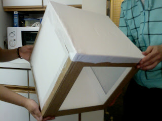
I decided that I wanted to experiment with handmade geometric elements. So, this weekend I made a diy lightbox to photograph the pieces in. :)
Here are some pictures of the box.


And here are some test shots.


Here are some pictures of the box.


And here are some test shots.


Sunday, November 1, 2009

Subscribe to:
Posts (Atom)